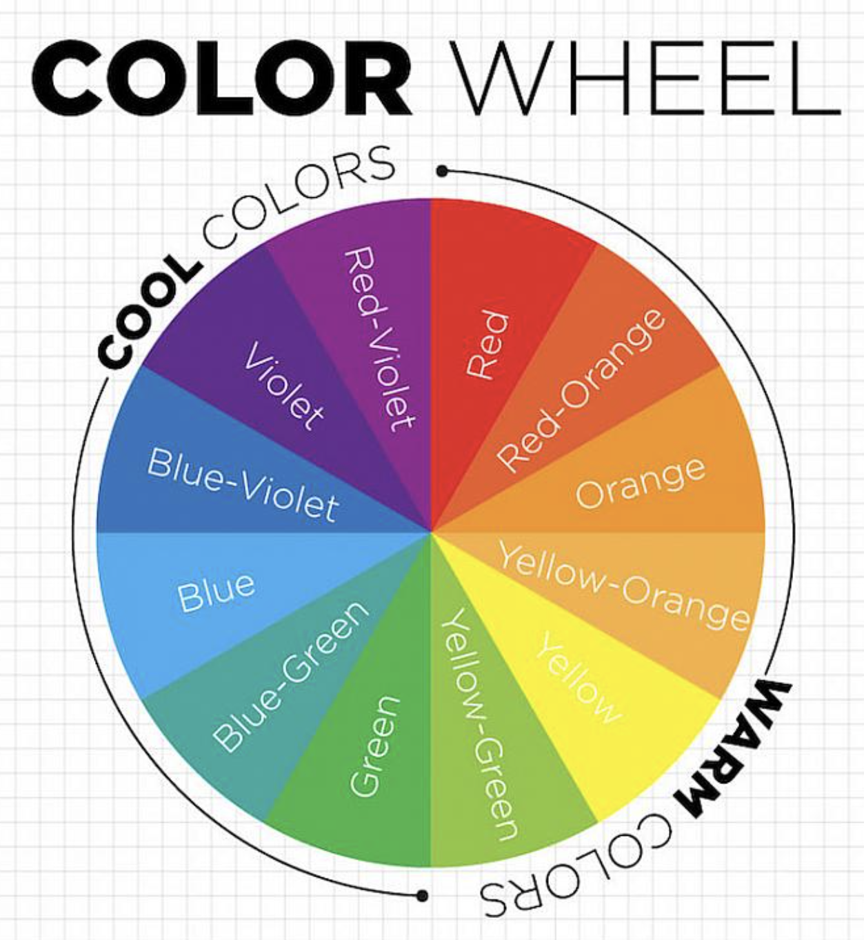
When it comes to designing a logo, one of the first elements that comes to mind besides the design itself is the color(s). Colors are vital to the image that is associated with your entity; whether you want your customers to feel excited upon seeing your brand or make them feel secure, the colors that you use to convey these messages are extremely significant. However, using just any combination of colors won’t do it. There is a method that can help you with color coordination and visual appeal.
That method happens to be color theory. According to Interaction Design Foundation, color theory is “the collection of rules and guidelines which designers use to communicate with users through appealing color schemes in visual interfaces.” Color is one of the most powerful tools for visual communication. It can influence our emotions, mood, and behavior. A specific color combination can go a long way when your entity is presented to a potential customer.
Color Groups
The first thing you should know is the different types of color groups that exist. Pulling color combinations from these groups alone will suffice for whatever design you’re wanting to make.
- Monochromatic Color Scheme
- This color group is basically a variation of one color (or hue) with different tints and shades
- Ex: A painting comprised of reds and nothing else

- Analogous Color Scheme
- Using the three colors that are right next to each other on the color wheel
- Ex: A design presented in yellow, orange, and red

- Complementary Color Scheme
- Using colors that are opposite of each other on the color wheel
- Ex: A movie poster with the colors orange and blue

- Triadic Color Scheme
- When making a ‘triangle’ on the color wheel, you get three different colors that are equal distances from each other
- Ex: Orange, green, and purple are visible on someone’s shirt pattern

There are many more color schemes than the ones listed above, but these are the fundamental color groups. When it all comes down to it, you likely won’t be using all of them at the same time. It’s more or less theory that can be used as a guide, but not strictly definitive of your work.
Color Meaning
The meaning behind colors are very important, and certain colors are chosen for specific reasons. Each color radiates an emotion and has the power to impact people’s feelings.
- Red
- Often associated with passion, danger, and heat
- Ex: Red stop signs, red firetrucks, etc
- Orange
- Used to express energy and creativity
- Ex: The Home Depot logo
- Yellow
- Exemplifies happiness and joy
- Ex: Think of the McDonald’s logo
- Green
- Used with nature, healing, and medicine
- Ex: Many health symbols in games use this color
- Blue
- Represents calmness and wisdom
- Ex: Blue hospitals
- Violet
- Symbolizes wealth, royalty, and ambition
- Ex: The robes of kings and queens
- Black
- Associated with death and power most of the time
- Ex: The grim reaper
- White
- Purity and peace are often associated with this color
- Ex: The company Dove’s logo
The next time you go to create your next art piece or consult a graphic designer for your next campaign, think about color theory and try to apply it as best as you can.


